
How to Match Statement Oil Paintings With Your Home Colors
Here's a common problem. Most families know how to buy paintings. But getting the colors to work with the room? That's where it gets tricky.
A lot of people live in regular apartments, not showrooms. Ceilings aren't that high. Lighting is just okay. And daily life fills up the space with stuff. So when you add a handmade oil painting, if the colors don't match your home's style, that painting can actually make the room feel off.
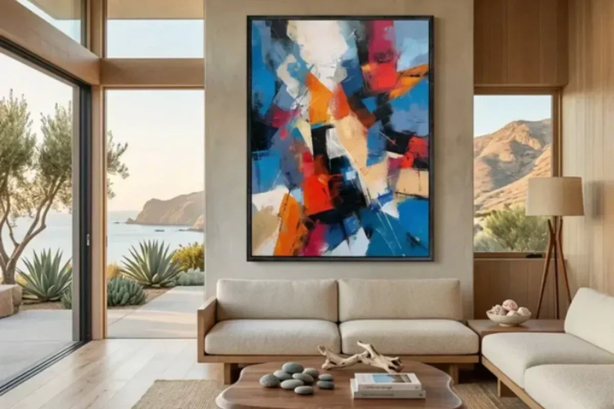
First impressions matter when you're browsing oil painting websites or shopping in person. Everyone knows that. But the real trick to making a living room look more polished? Pick artwork whose colors naturally fit with what you already have.
Light-colored living rooms often end up looking "forced"
Cream-themed bedrooms and living rooms are all over social media. Lots of people copied the look. Off-white walls, light curtains, cloud-shaped sofas. It looks nice in photos.
But there's a problem. Too much off-white actually makes the space feel emptier.
Especially at night. Turn on the lights and the whole room looks like it's soaked in warm water. Nothing stands out. And that leads to visual fatigue.
Here's a fix. Add an earth-toned oil painting like Muted Weave Wabi Sabi Painting. It creates a smooth transition from off-white to earth tones. No jarring contrast. Plus, warm earth tones make the room feel cozier.

A few tips. Don't go with dull vintage brown. Pick warm tones that feel more like earth or linen. Think shades like:
- Caramel brown
- Dusty olive green
- Terracotta
Choose an oil painting in one of those colors. Pair it with thick paint texture. It'll look even better, especially in the evening. When the side light hits it, the wall starts to show layers.
One thing to avoid. Abstract paintings with very light colors. They'll only make the empty feeling worse.
Dark-colored furniture doesn't go well with soft-style oil paintings
A lot of people pick dark furniture at first because it hides dirt better. Then later, they fall in love with soft-colored decorations and start adding bright pieces. That's when things get weird.
Dark furniture already draws plenty of attention on its own.It needs contrast, not random color clashes that leave the room looking busy and disconnected.A black and white abstract piece actually works better here than a colorful statement painting.
This is especially true for large pieces. Take the living room in the picture. It has a large Ivory Ebony Divide Abstract Wall Art piece. No extra small elements. Just a simple painting against a big blank wall. The negative space makes the room feel naturally sophisticated.

Some people worry that black and white prints look too much like hotels. True, but that's because hotel prints are usually "too thin."
Black and white oil paintings that work well at home have strong, visible brushstrokes. Up close, they might even look a little rough. But that thick texture softens the cool look of a dark gray sofa.
Stay away from bright oil paintings in wabi-sabi style rooms
Wabi-sabi homes have a certain look. The room might seem empty, but every piece of furniture and decoration went through careful selection. That's especially true for the oil painting hanging in the center of the room.
Don't just buy those plain textured abstract red and green patterns because they're labeled "wabi-sabi art." Hang them up and your space will go from wabi-sabi to cheap and unappealing real quick.

Instead, focus on low-saturation colors :
- Soft linen tones
- Smoky brown
- Light coffee
- Beige that looks like old paper
Honestly, paintings that are almost "colorless" tend to look best over time. Especially landscapes with some empty space, or blurry silhouettes of people.
These paintings might not grab your attention right away. Over time, though, they settle into the room beautifully.
Does Luxury Design Have to Rely on Gold?
A lot of people leave comments on home decor channels saying that minimalist luxury styles often backfire.
Here's why. Most people are still stuck on old ideas. They buy fancy crystal chandeliers, stone slabs, metal lines, glossy TV walls, and then hang up an abstract painting covered in gold leaf. All to create a "light luxury" look. In the end, their home looks like a private club.
For a truly understated luxury look, dark colors work great. Deep blue and burgundy are always good choices.
- Midnight blue, Gray blue, Dark blue
- Wine Red
- A tiny bit of gold detail is enough
These darker paintings have another advantage. They help tone down visual noise. Especially at night when warm lights are on. Dark blue and burgundy tones feel softer and less heavy than pure black.
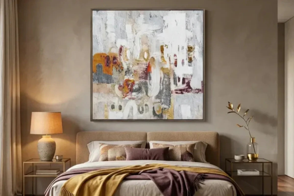
Bedrooms need a different approach
The bedroom is where people rest. So stay away from bright, stimulating colors in here.
Quiet colors like dusty rose, light brown, and misty blue work better. Or even a simple solid-color handmade textured painting.
Keeping things simple makes the bedroom easier to relax in.
Of course, the painting should still match your taste. The main thing is that you won't get annoyed looking at it right before you turn off the lights at night.
Some colors just don't work well at home
One more thing. Oil paintings look different on a screen than they do in person.
If you can't buy the painting in person, avoid ordering highly saturated colors online. Things like fluorescent orange, bright purple, or vibrant emerald green.
Most families can't pull these off. Unless your lighting, furniture, flooring, and soft furnishings all work together perfectly, these high-impact colors will make the space feel unbalanced.
Oil paintings aren't phone wallpapers. They're going to stay in your home for a long time.
More important than "instant excitement" is "comfort after living with it for a while."Pick timeless colors. That's the safest way to avoid messing up.